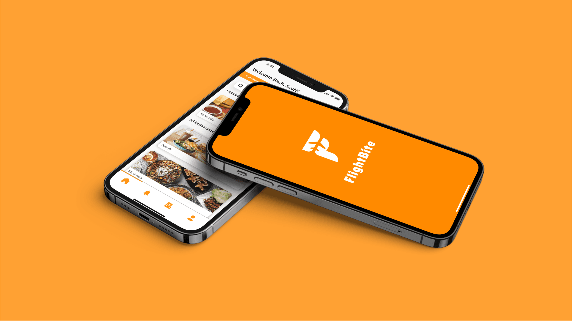
FLIGHTBITE
My Role
UX Researcher and Designer
Since the Covid-19 pandemic hit, people started to act different in public transportation areas. What can be done to help people feel comfortable in these highly populated spaces?
How can airports reduce contact points to promote sanitary conditions and provide healthy and safe queue environments?
GOAL
PROVIDING COMFORT
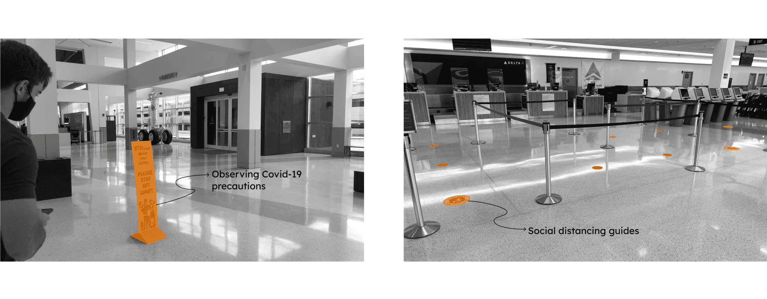
Since the start of the pandemic, many individuals have started to feel uncomfortable in public spaces such as the airport. To better understand these users, we must observe them in the airport and speak to regular travelers directly.
RESEARCH
UNDERSTANDING USERS
A survey was sent out by my team to gather data about people's feelings and tendencies around different areas of the airport. After receiving over 100 responses, we found that 60% of people were now less likely to eat in airports since the pandemic. For further information, I took to interviewing 3 people that fly multiple times a year.

Megan
Age: 23
Flies multiple times a year, mostly in the summer
"The ease of the entire process, even though it is new to everyone, it is something they would be able to pickup right away. It seems so intuitive."

Jason
Age: 50
Flies for vacations with family
"It is nice to have handful of restaurants to choose from. Sometimes it would be nice to have already ordered food and be able to pick it up at a locker to save myself time."

Pedro
Age: 22
Flies back home from college during breaks and summer
"I think the ability to order food on the plane and pick it up when you arrive is really smart, especially considering that people have layovers."
CREATING A SYSTEM
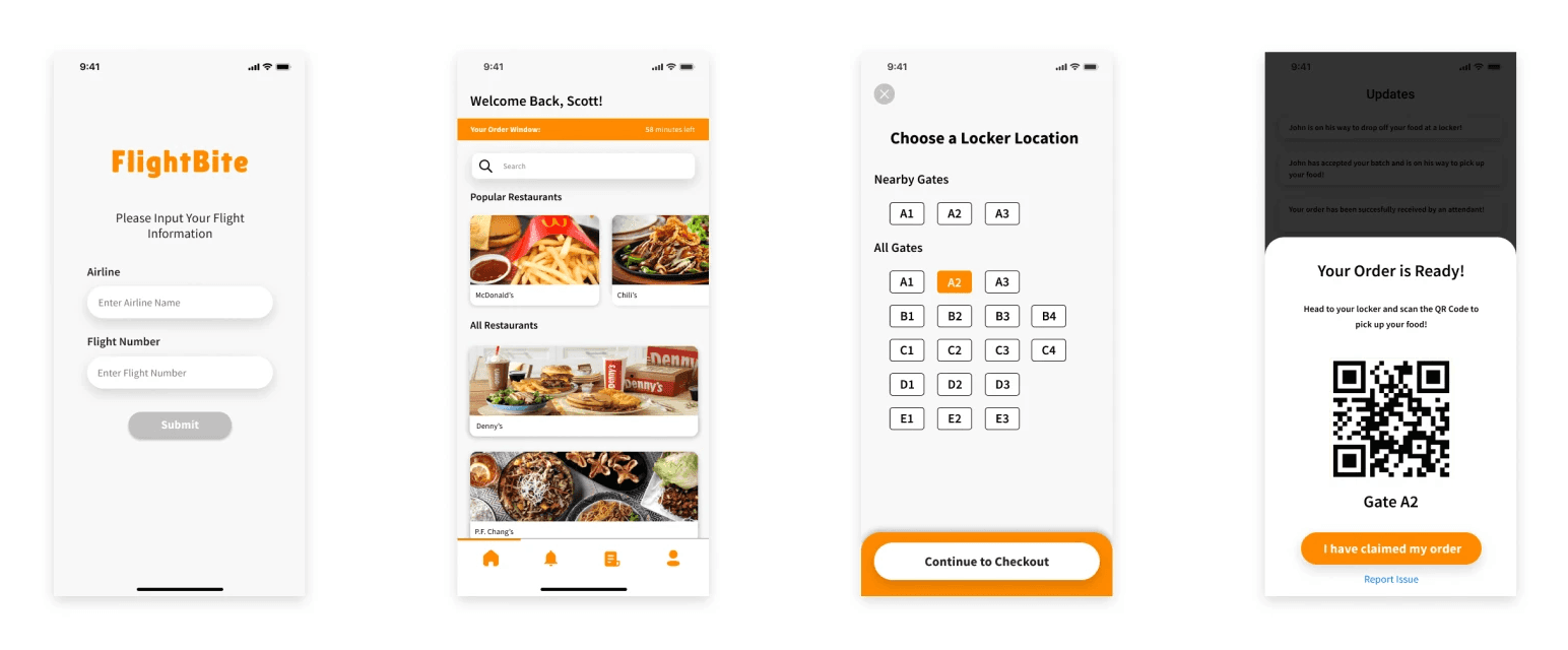
My design revolves around a food pickup experience at airport gates. Users have the opportunity to order on their phone or via in-flight entertainment system. Food lockers located around the airport gates will hold users' meals whether hot or cold. Each locker is securely locked and only accessible to the worker and specific user.
IDENTIFYING SCREENS
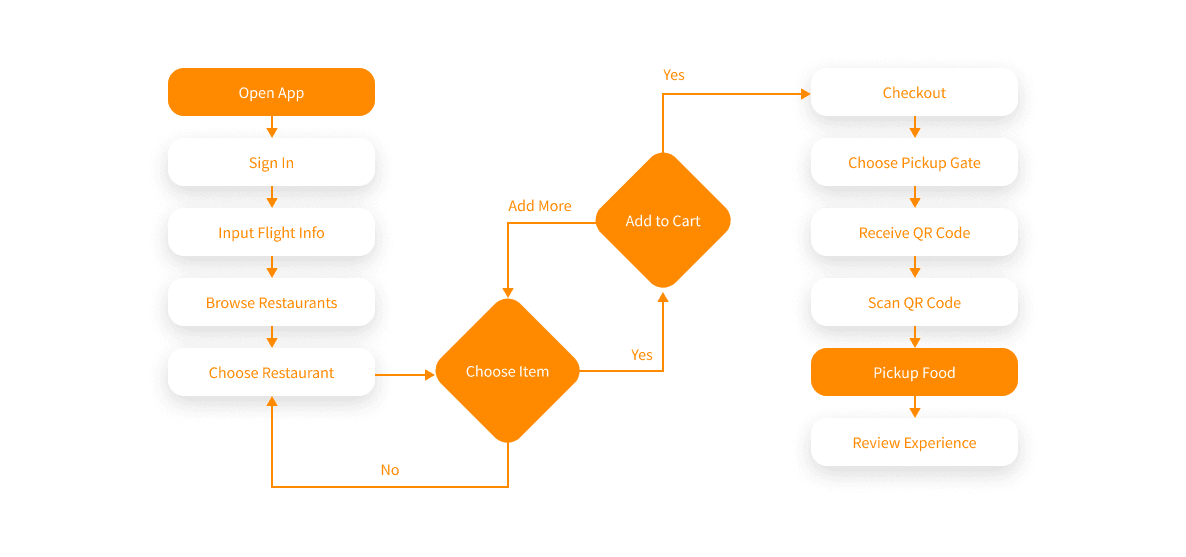
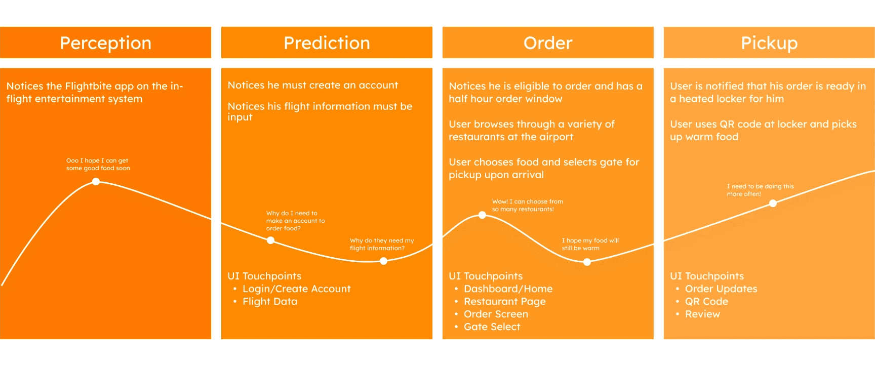
It was necessary for me to identify the path users would take throughout the food delivery process and what screens would be necessary. Creating a user journey map was essential in coming to a solution.
DESIGN
DIFFERENTIATING CUSTOMER AND WORKER SYSTEMS
For this system to work, there must be an app for both the customer to order from and the worker to receive orders and deliver them to the corresponding lockers. Below is a prototype of the consumer app, FlightBite, and the worker app, FlightBite Attendants.
BUILDING A RECOGNIZABLE EXPERIENCE
By taking inspiration from food apps and movie apps, I have created screens that are recognizable to users. The food ordering aspect is very similar to other food ordering apps. The locker selection and QR code are similar to choosing a movie theater seat and getting a QR code to scan your ticket at the theater.
KEY LEARNINGS
Importance of Research in UX
This project sparked my passion for UX design. Previously, I had research and design experience in industrial design. I learned how to conduct new research methods and gained a new appreciation for how research can significantly shape the final design of a product.
User Testing is a Continuous Process
At first, I thought that the research process ended once the final product was designed. However, I discovered that this is completely untrue. There is always room for improvement in a product through further research and testing.
Managing a Design Team
In this project, I took initiative in organizing tasks, setting deadlines, and guiding research. During Covid, it was extremely difficult to meet in-person. I learned how to effectively communicate and lead a UX design team utilizing online tools.