GAMERVAULT
My Role
UX Researcher and Designer
Empowering users to track their gaming-related expenses, including game purchases, microtransactions, and subscriptions, all in one place. By providing detailed insights, budgeting tools, and seamless integration with gaming platforms, GamerVault helps gamers stay in control of their spending and make informed financial decisions.
How can we empower gamers to effectively manage and optimize their gaming expenses, ensuring financial well-being while enhancing their overall gaming experience?
DESIGN
BUDGETING
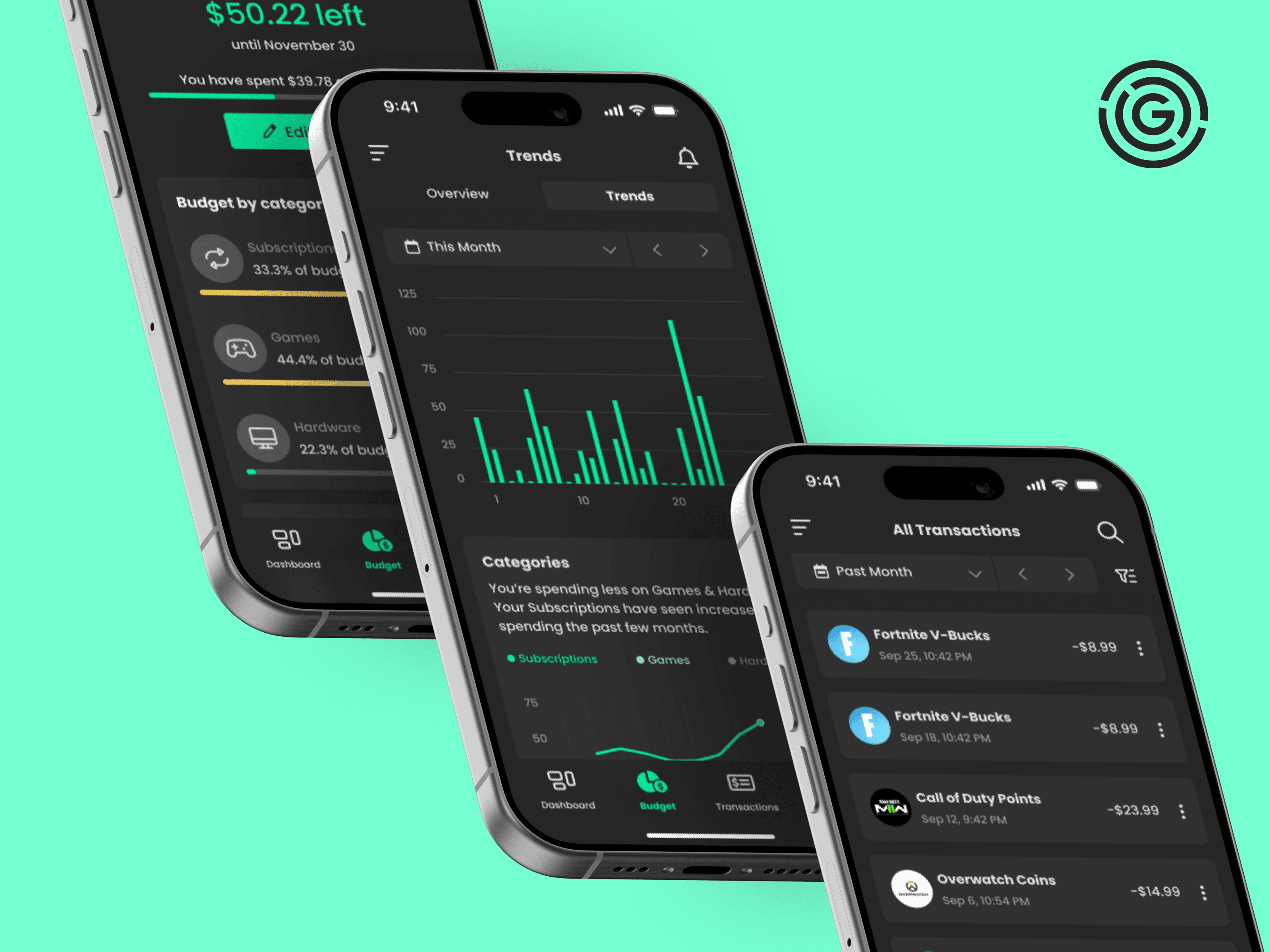
The budgeting screens enable users to set a budget for a desired time period. They can then set up specific budgets based on category or by game. Users can also view their spending trends to help them make better financial decisions.
TRACKING TRANSACTIONS
Users can track all of their gaming related transactions in one location. These transactions are separated into one time payments and recurring payments.
WISHLIST
The wishlist enables users to determine whether their wanted products fit in their current budget. This helps them make informed decisions on their next purchase.
MARKET GAP ANALYSIS
IDENTIFYING OPPORTUNITIES
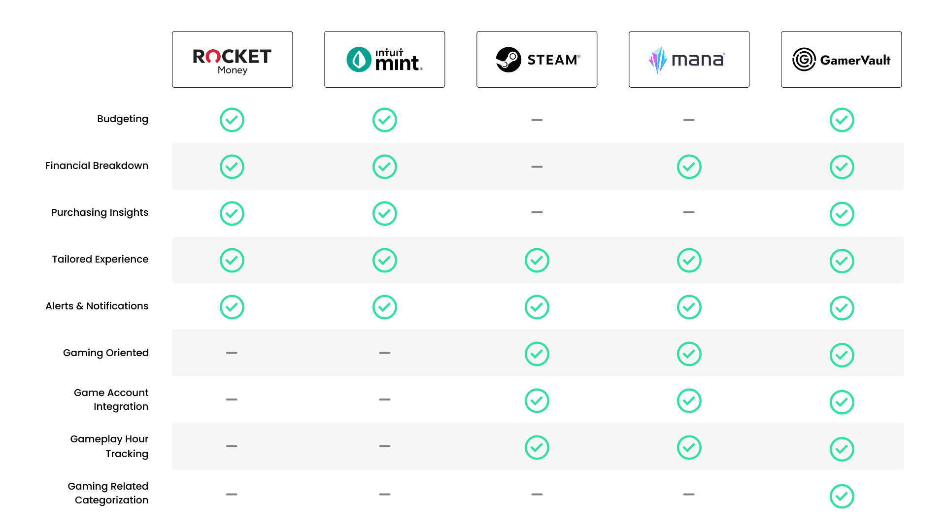
My comparative analysis reveals significant gaps in the current market for gaming finance management tools. Existing products lack the specific features gamers need, such as detailed tracking of microtransactions and seamless integration with gaming platforms. GamerVault addresses these unmet needs, providing a tailored solution that combines financial oversight with the gaming experience.
INFORMATION ARCHITECTURE
STRUCTURING THE FOUNDATION OF GAMERVAULT
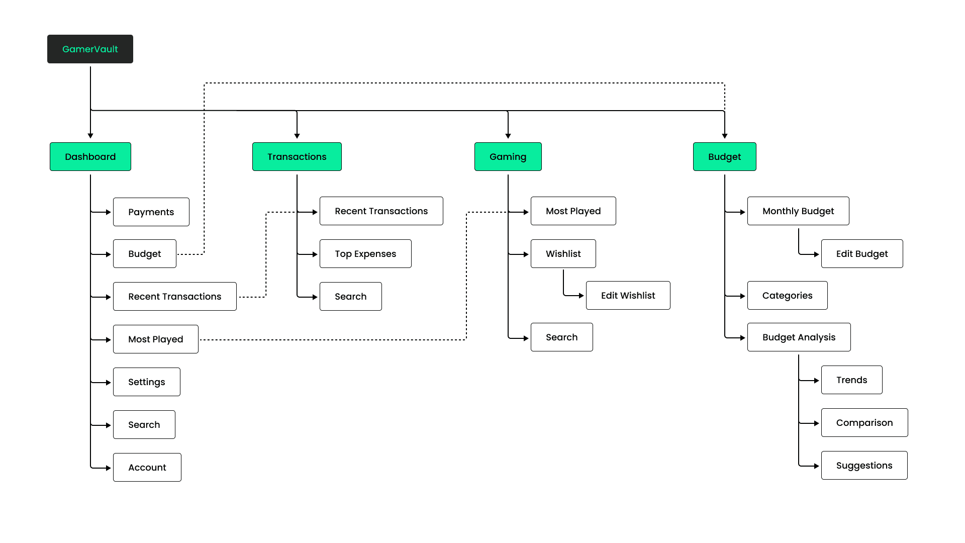
Establishing a clear and intuitive information architecture was crucial in the early stages of developing GamerVault. By organizing the app around core pages such as Dashboard, Transactions, Gaming, and Budget, I ensured that users could easily navigate and manage their gaming finances. This structure not only enhances user experience but also supports the app's functionality by providing a logical flow of information that aligns with gamers' needs.
TESTING
BUDGETING CHANGES
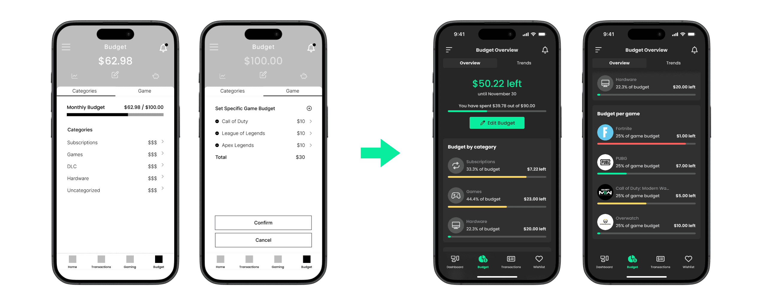
Users had some difficulty with navigating the initial budget interface. By creating clearer buttons and budgeting cards on a single page, users could now easily navigate through the budgeting screen.
IMPROVED WISHLIST DISCOVERY
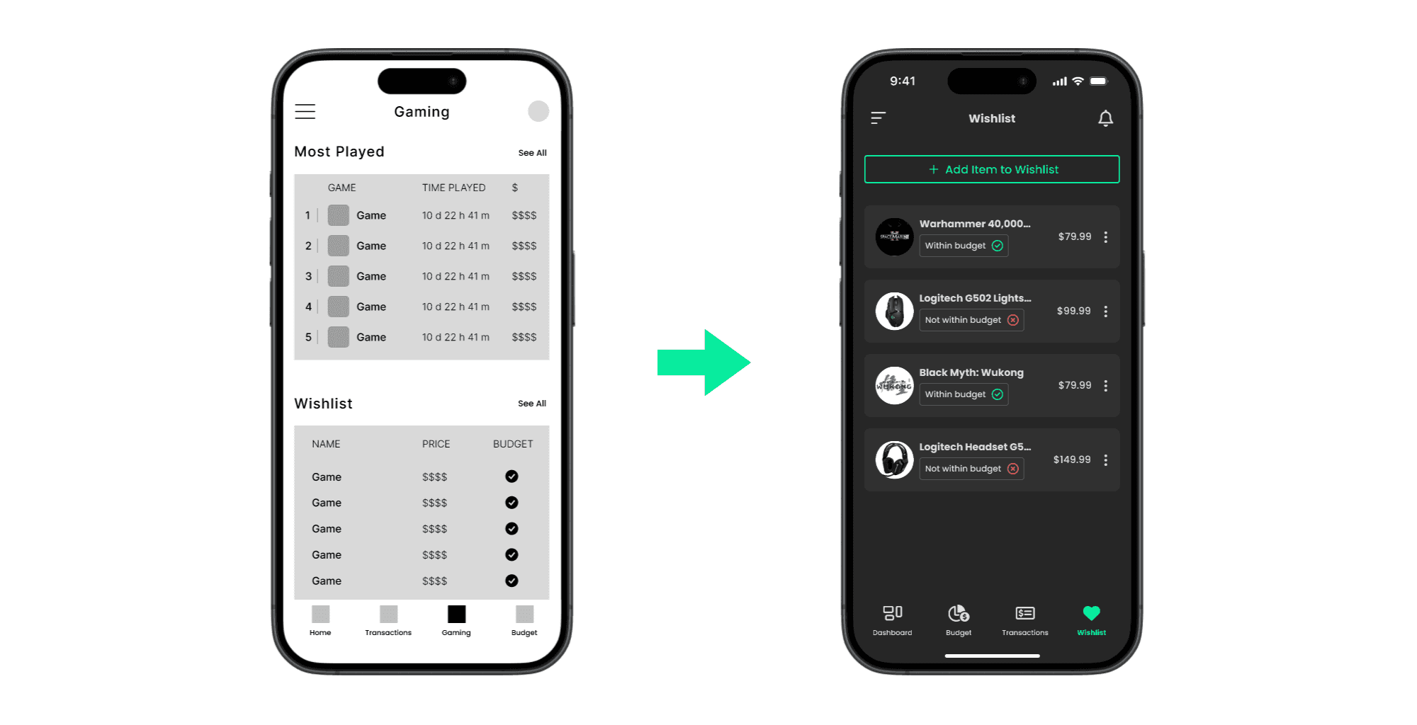
Based on user feedback, the wishlist was difficult to locate when starting from the dashboard screen. Additionally, the most played feature was viewed as non-essential. To fix this issue, we removed the gaming page from the bottom navigation and created a dedicated wishlist page.
BANK LINKING AND USER TRUST
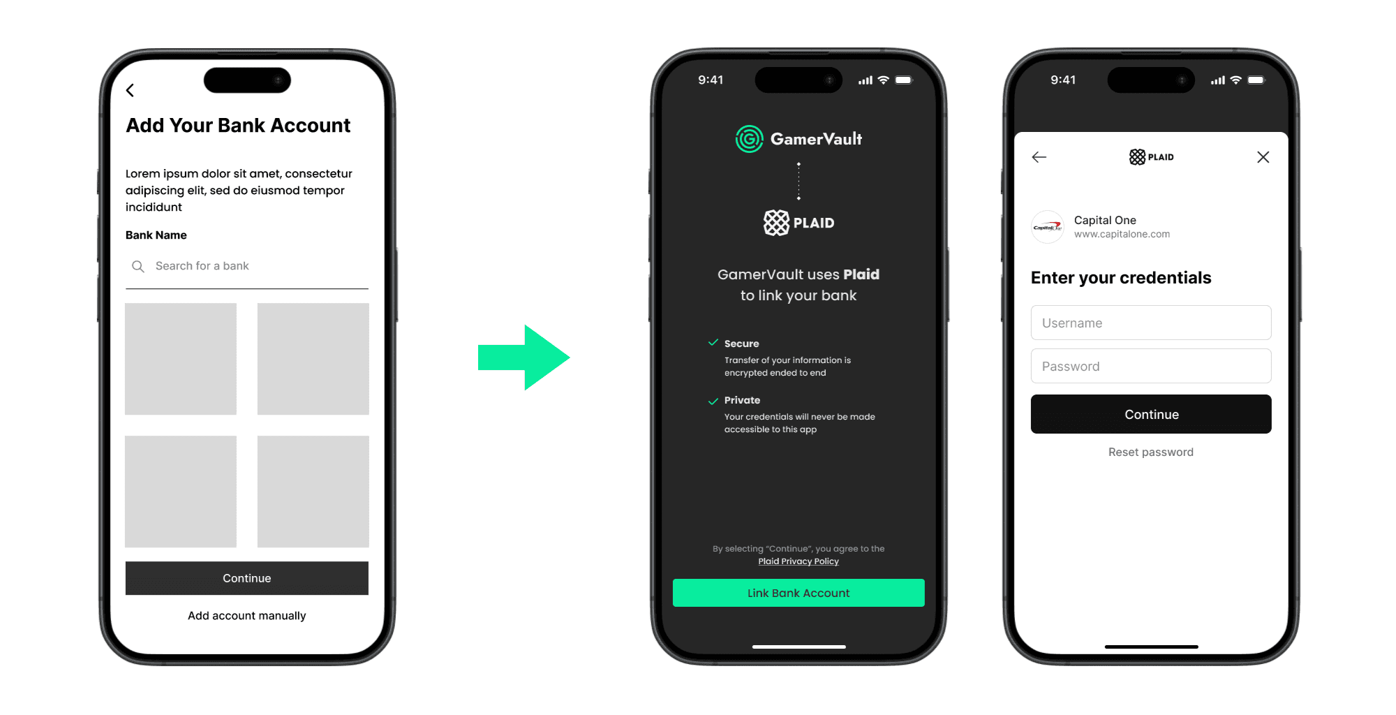
Users brought up issues of trust and concerns of how to link credit cards to their account. We implemented Plaid integration to our design which users said they trust.
DESIGN EXPLORATION
WEB DESIGN
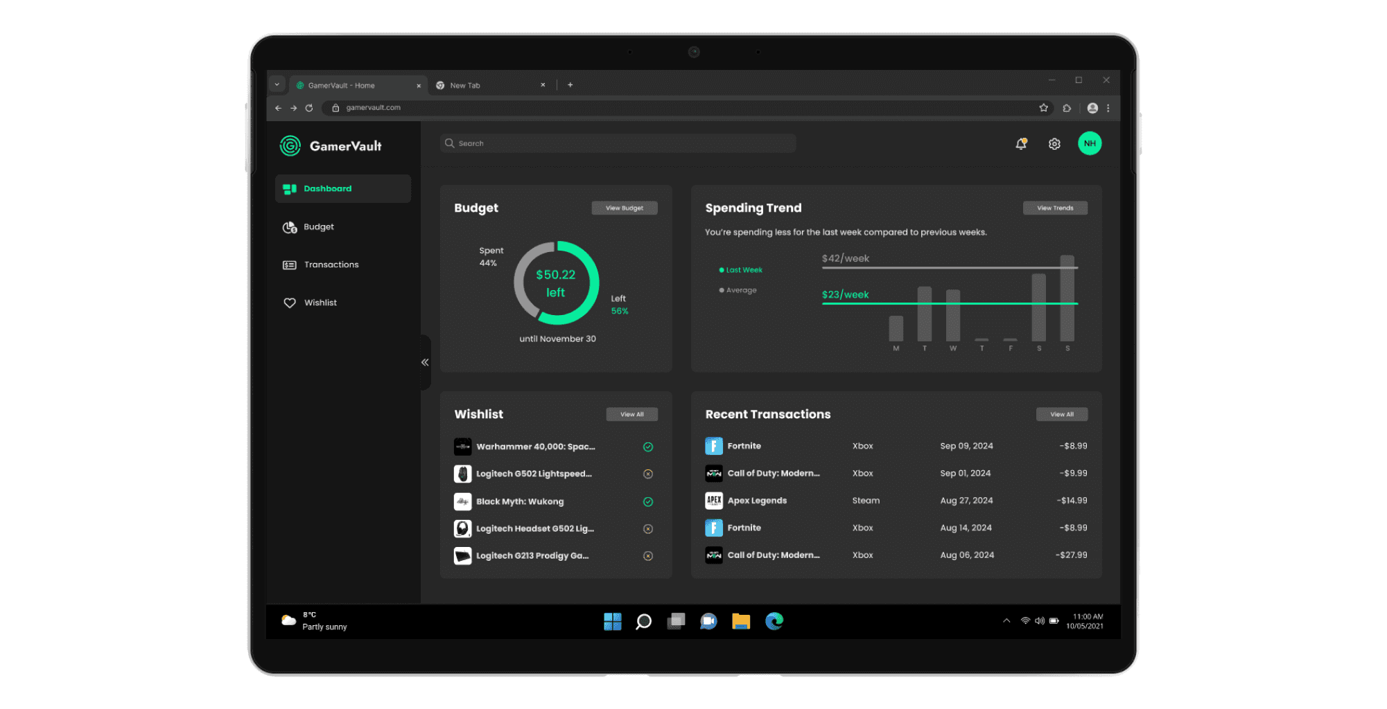
We wanted to imagine how our product would look on desktop, as many gamers use a PC as their priority gaming platform. Our design system helped us to mock-up a design that would be familiar to users who have experience with the mobile version of GamerVault.
COLLABORATION
DESIGN SYSTEM
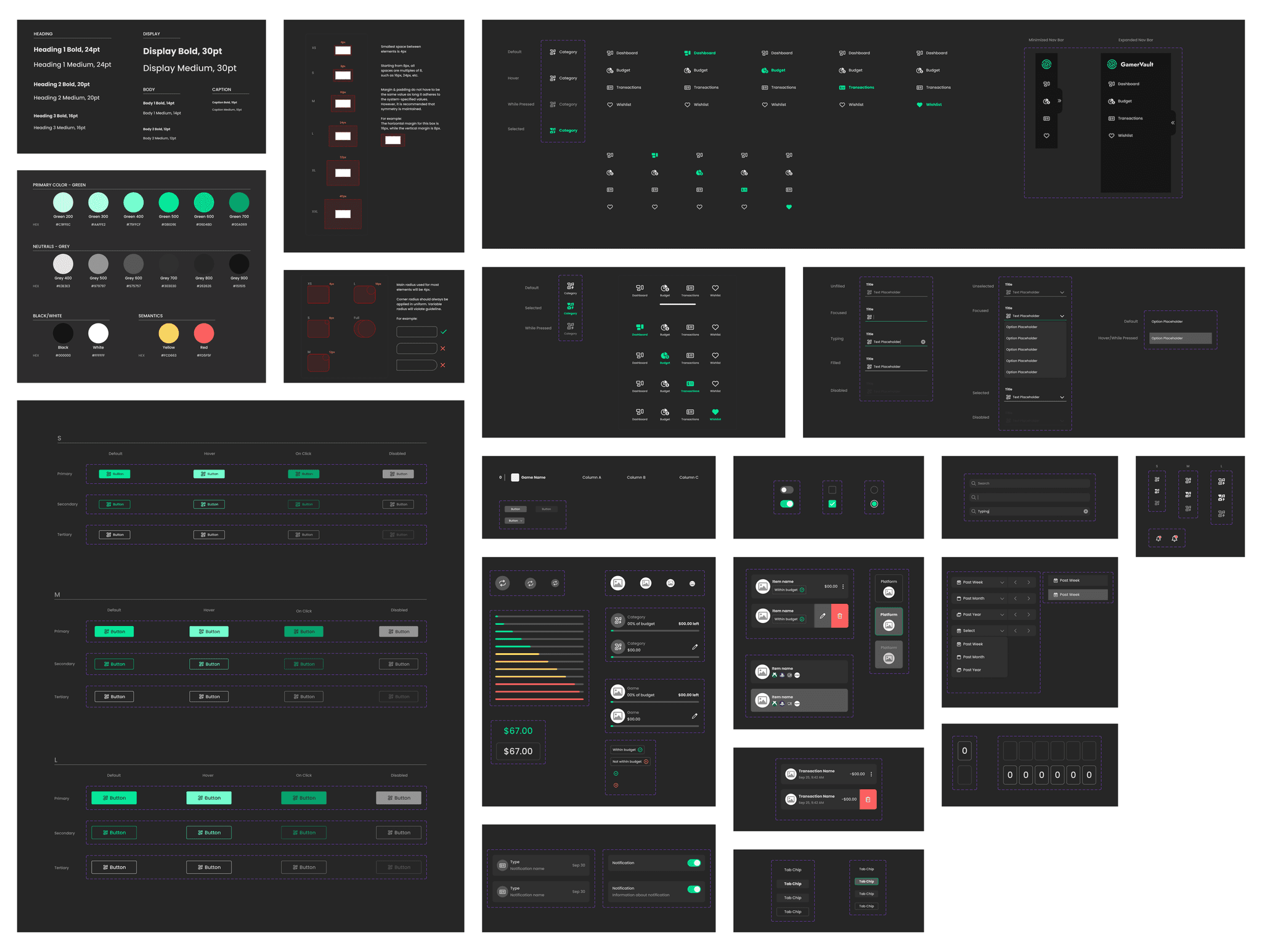
As a team of 2 designers working simultaneously on the design of the product, it was important for us to maintain a well-organized design system. This allowed us to create consistent layouts and functionality of each screen.
KEY LEARNINGS
Importance of a Design System
I realized how important it is to set up a complete design system before diving into the high-fidelity design of a product. This helps with consistency and can save a lot of time in the design process.
Openness to User Feedback
When testing our product, we found that functionality which we thought was intuitive and common did not work for some of our users. It was important that we changed these to more recognizable functionalities rather than forcing users to adapt to them.
Communication in Co-Designing
When designing a product at the same time as another designer it is important to set standards, timelines, etc. Effective communication among the two of us was essentially in creating a fleshed out, cohesive design.