PATH
My Role
UX Researcher and Designer
People of all ages struggle with determining whether they are on the right career path. Many find difficulty choosing their next steps. How can this process be easier?
How can we simplify the job searching process for people who are looking to switch their career?
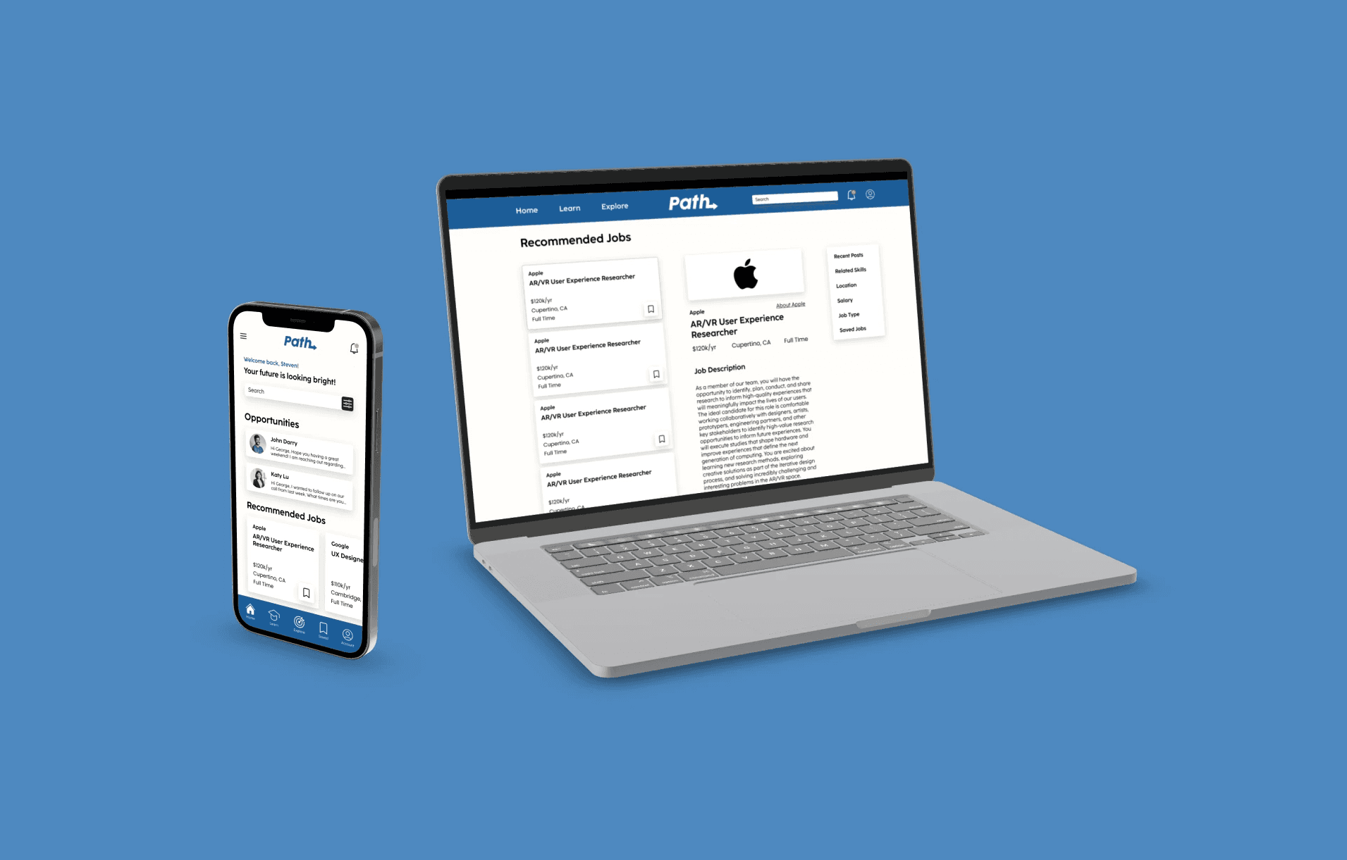
FINAL UI
ONBOARDING EXPERIENCE
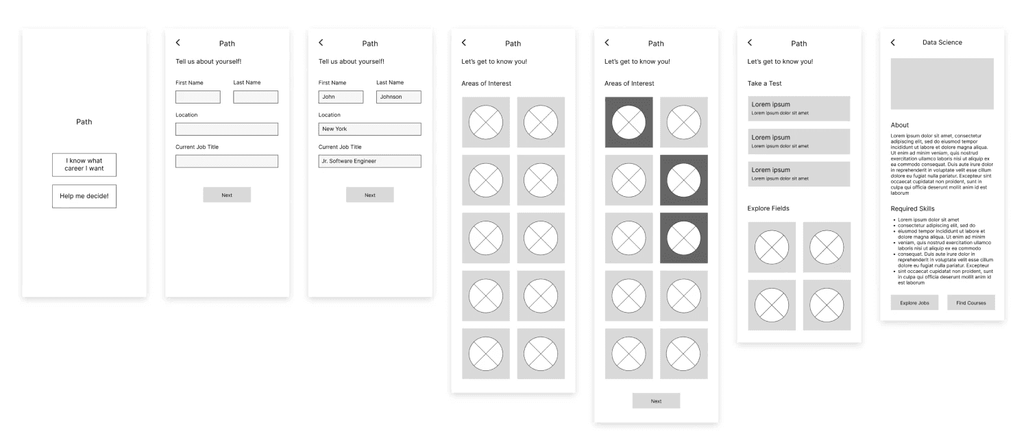
After showing the wireframes to potential users, a vast majority enjoyed the experience and did not give any negative feedback. Some minor changes were made such as creating the full name field and adding text to the area of interest cards for better identification.
PRODUCT FEATURES
JOB AND COURSE DISCOVERY
Users have the ability to search for recommended jobs and courses based on their career interests. They can view all of their saved postings in one easily accessible location.
GOAL & RESEARCH
REDUCING USERS' STRESS
In creating a career searching platform, it is essential to create a system that guides the user to potential options for a new career path. Doing so will take some stress off the user and avoid the hassle of getting overwhelmed with the abundance of different job fields.
Career Options
Over 12,000 different careers - LinkedIn
Regretting the Past
~47% of millennials wish they had chosen a different career path - CNBC
Job Change Rate
People ages 18-24 tend to change jobs an average of 5.7 times - Indeed
EXPLORING FEATURES
Path is more than just a platform for users to determine their next career. It recommends to users the best online courses, career tests, and has a built-in job searching functionality. It is the one place people can go to for the best information on all job fields.

MOVING INTO UI
ONBOARDING EXPERIENCE
The onboarding experience of an app is important in gaining a user’s interest and trust in the product. I decided to create low fidelity wireframes to map out the flow of the first screens of the app. It takes the user through a short series of steps that will further guide the recommendations for the user’s career path.

UI ELEMENTS
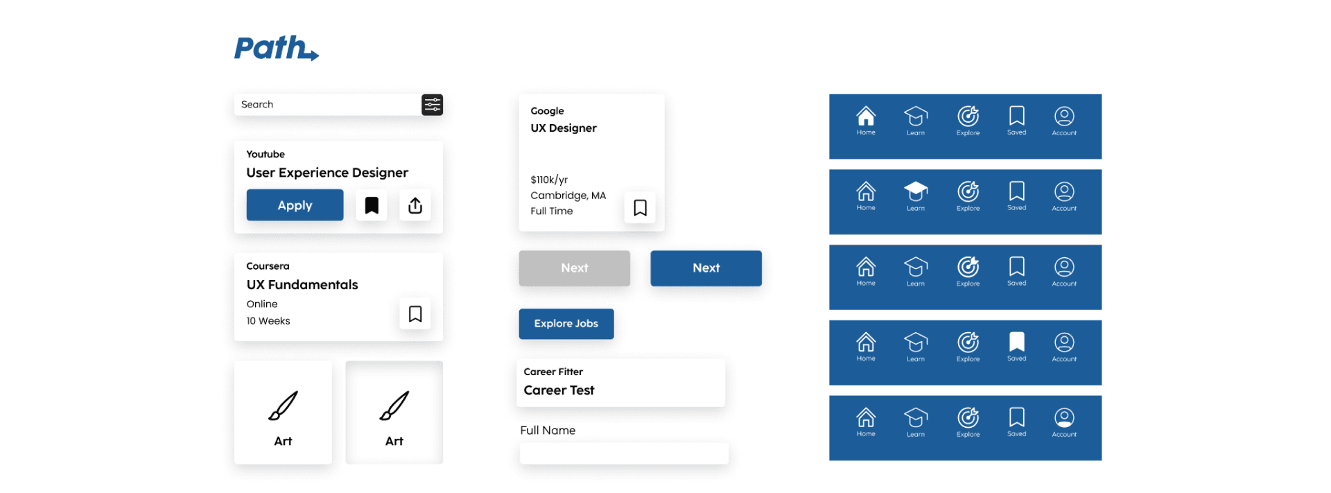
While creating the app, I decided to catalog the UI elements I designed. These elements can be made into a design system and UI kit for reference for other designers and developers if I am to move forward with launching the product.

DISCOVER YOUR PATH ON THE GO
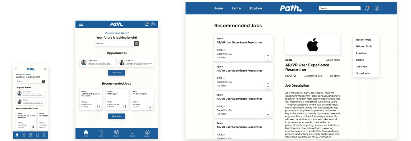
When designing the app, I came to realize that users may want to use this platform on different devices. Since everyone has different access to device types, I decided to create screen layouts for tablet and desktop as well.

KEY LEARNINGS
Avoiding Bias in Familiar Topics
The idea for this project came to me through my personal struggle of switching careers. Since I could heavily relate to the topic, I found it difficult to dissociate my personal thoughts when designing the app. I began to develop skills to help me avoid bias which I will carry on to future projects.
Strengths of Responsive Design
The key to an intuitive user flow across devices is responsive design. I learned that it is important to design an interface and architecture that is consistent across all screen sizes.
Creation of a Design System
Through this project, I was introduced to the concept of creating UI elements for a design system. Initially, I had created the designs before setting up the elements in a design system. I now know to set up the design system before going into the final design stage.